Packeta
Interior
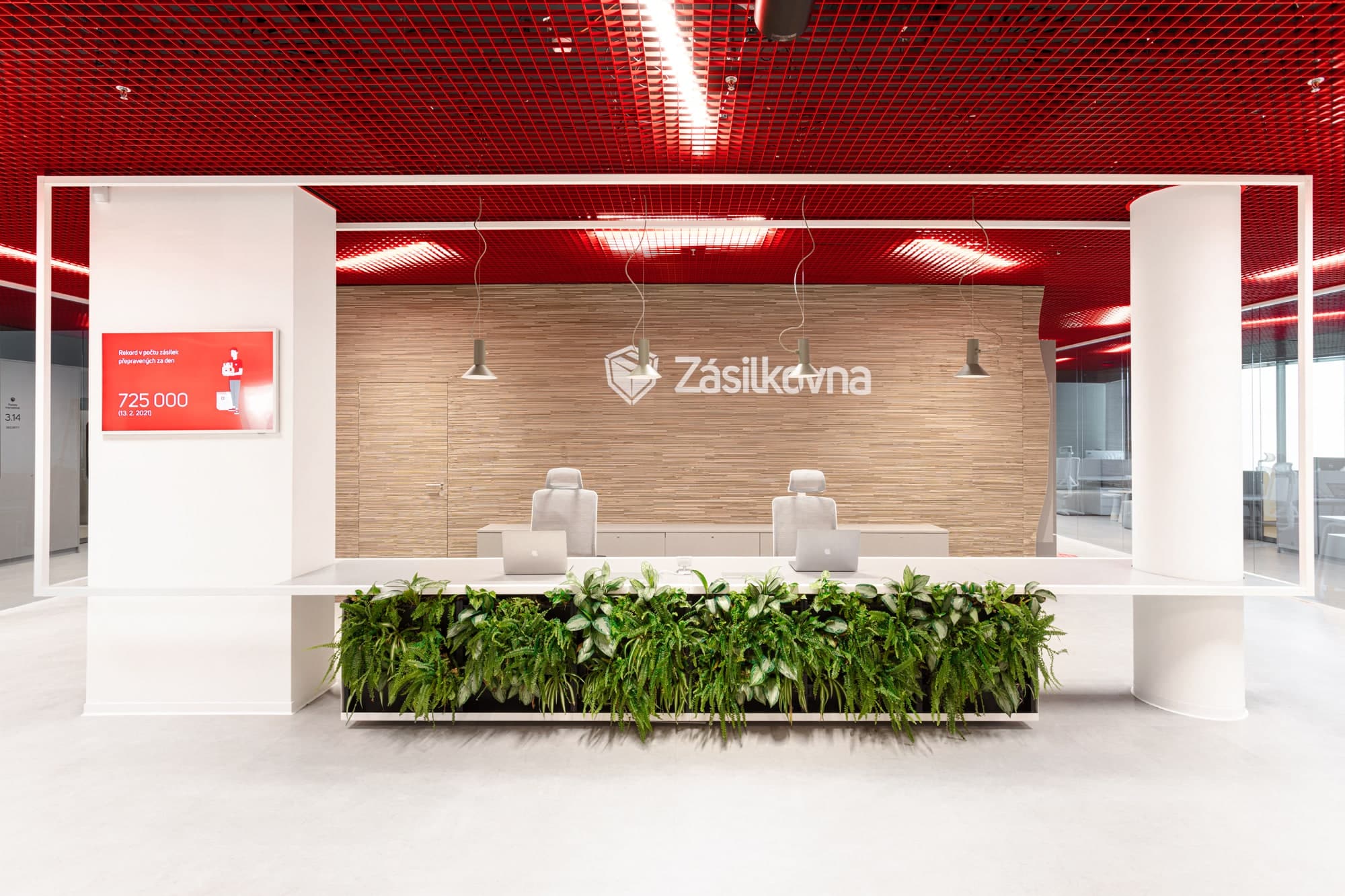
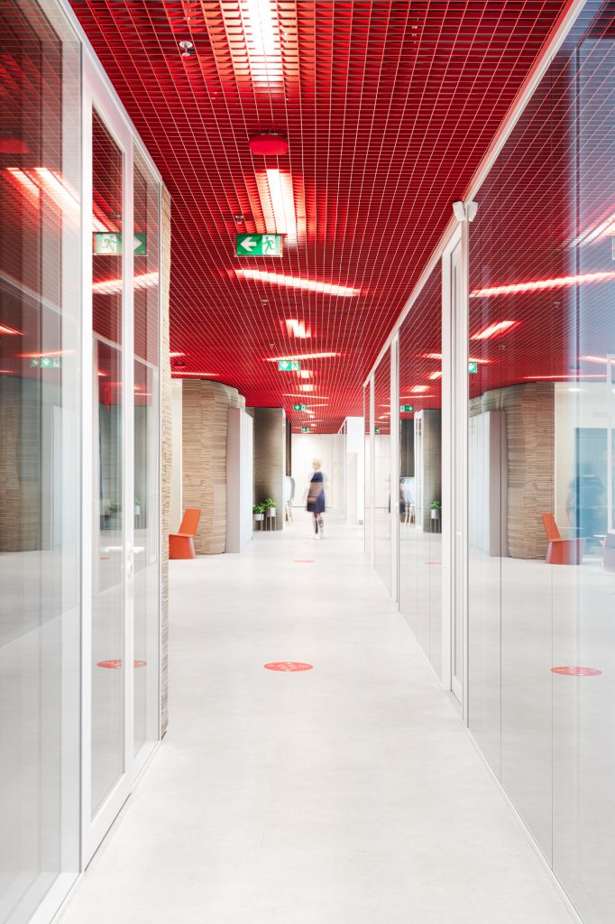
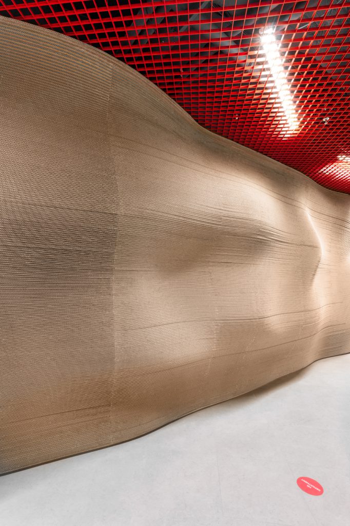
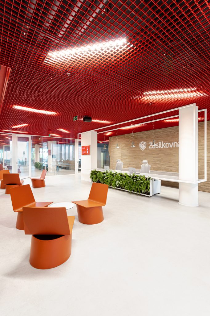
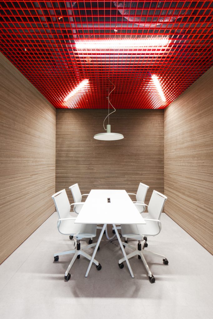
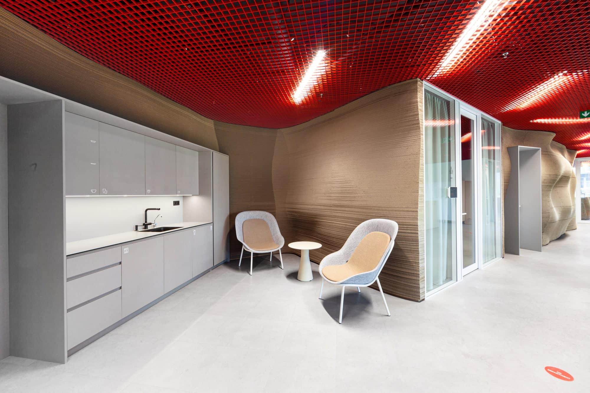
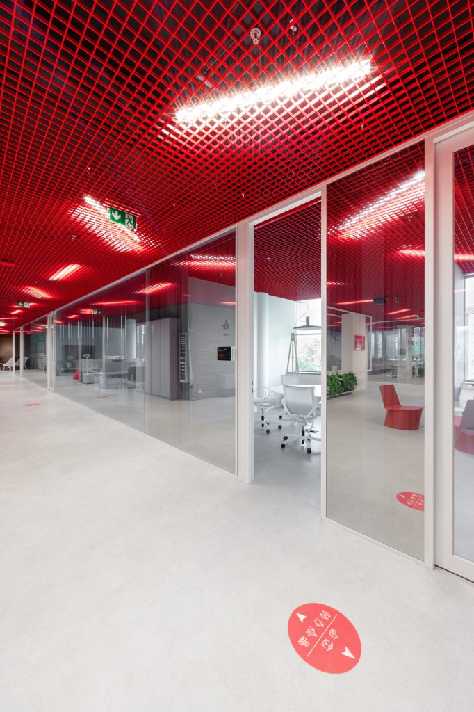
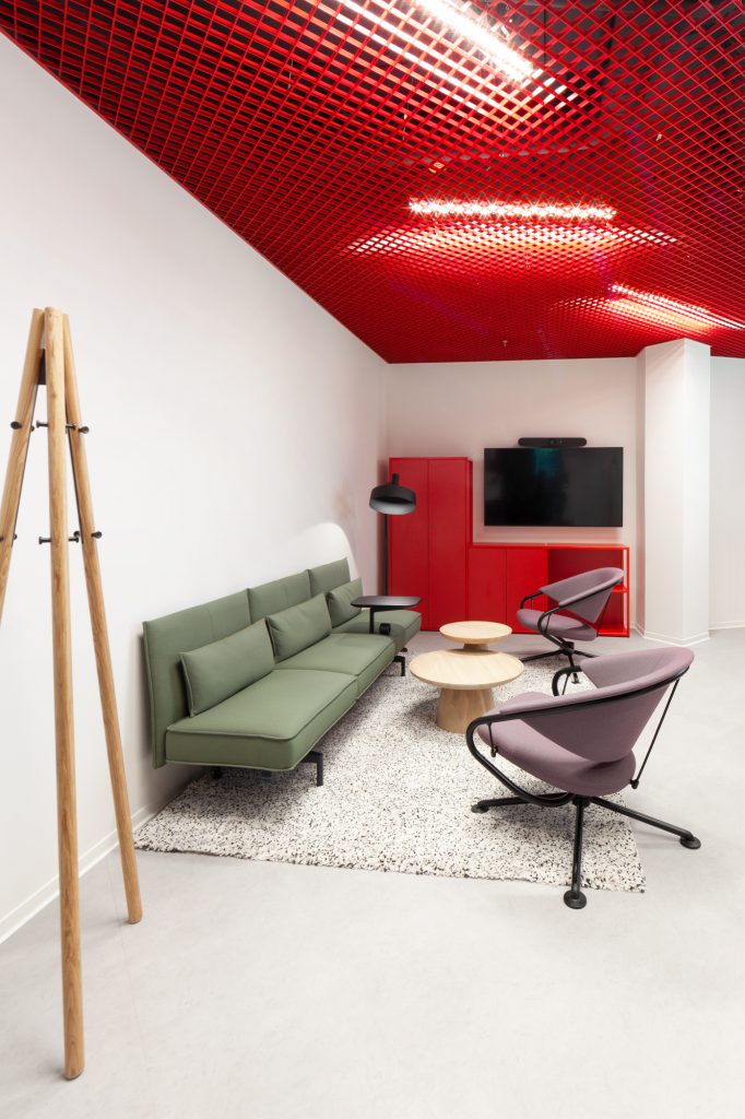
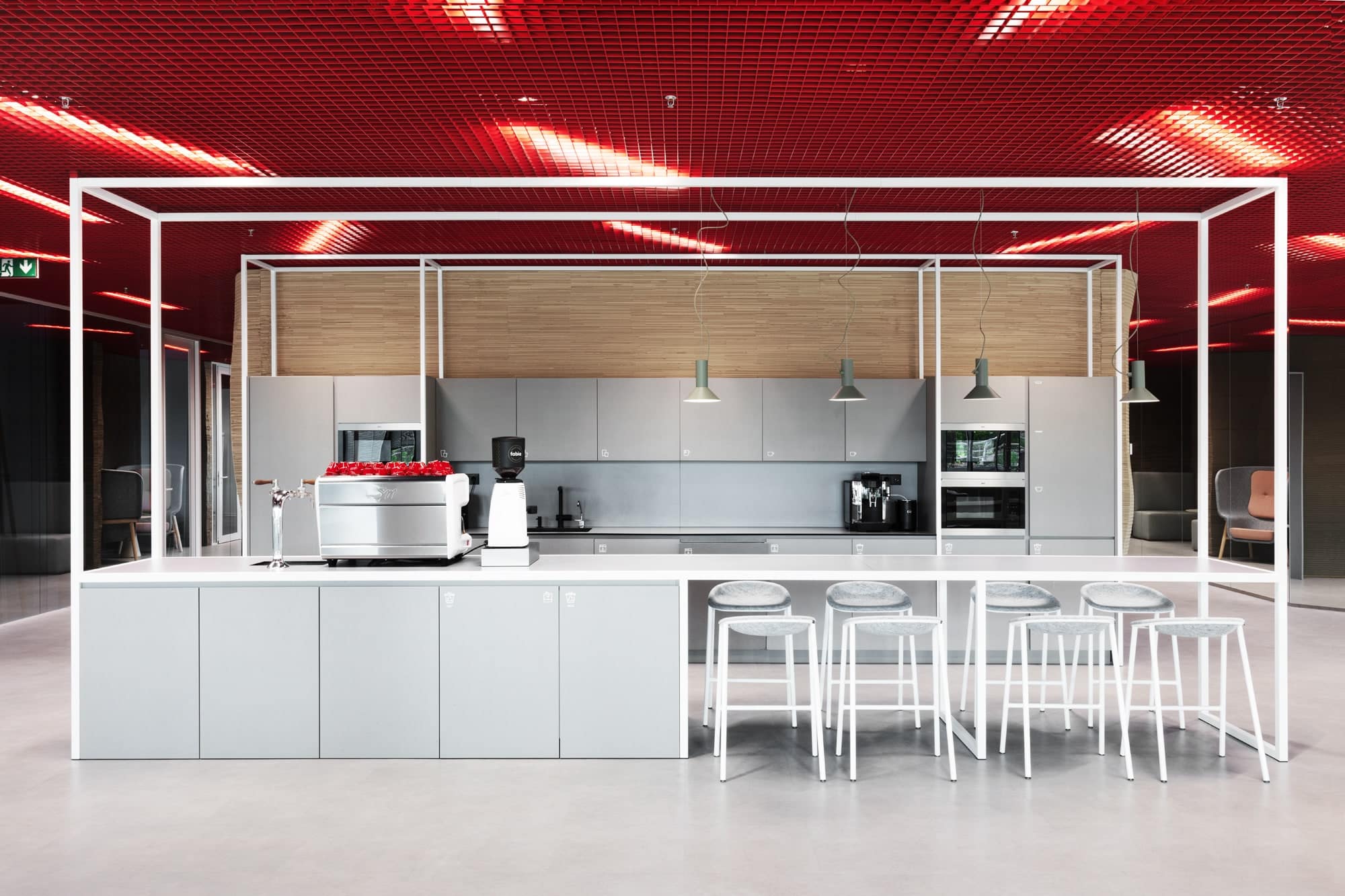
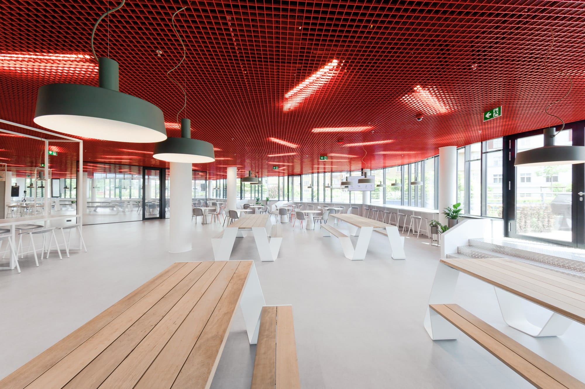
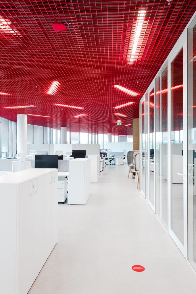
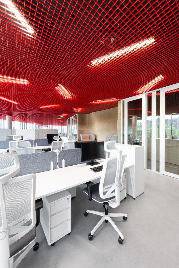
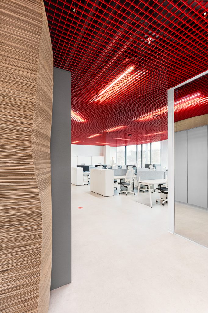
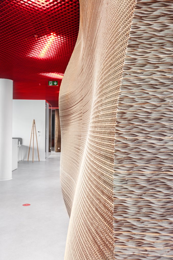
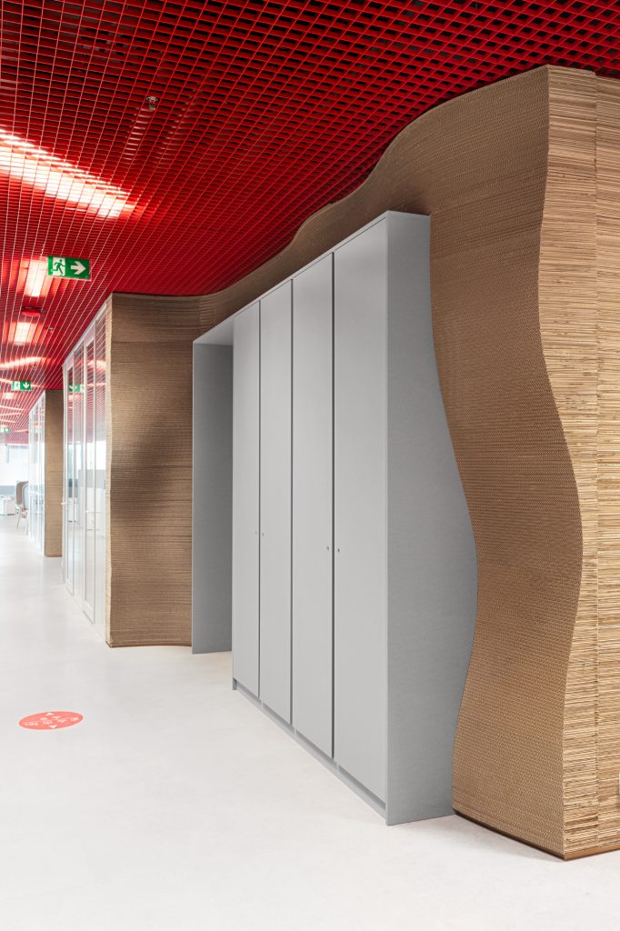
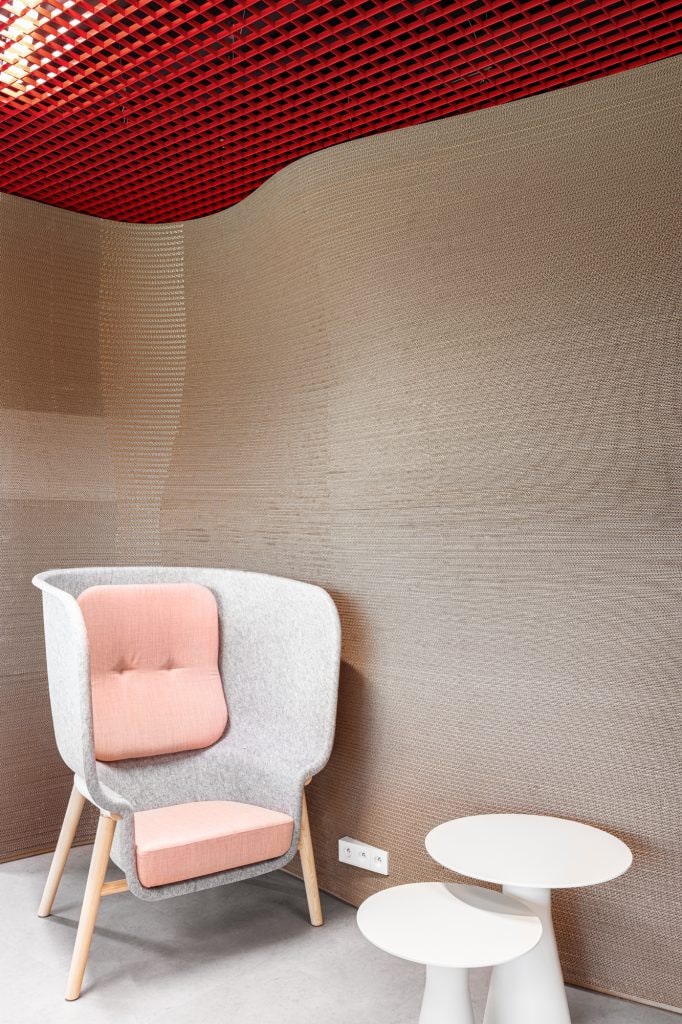
We conceived the offices for Packeta as a declaration of sustainability by the logistics leader of the Czech market. The brief was clear - to bring emotions, corporate identity and technology that are significant for the company and its development into the interior. The main motif was the application of upcycled shipping packaging (one cycle of a box is about five uses). By layering them, we formed an authentic sculptural mass that remotely resembles sedimentary rock. In doing so, we helped to give a second life to a material that otherwise becomes waste, while also having a significant positive impact on the acoustics of the space. All supported by a red aluminium ceiling, referring in its form to logistics depots and their environment. The red colour is so characteristic of the Parcel Factory that we decided to apply this colour to the ceiling. This created a dynamic and vibrant space that is otherwise calmed by white and grey tones. The photo shows the reception area with an example of the adaptive light logo, which allows for a simple and easy change of display. This allows the client to easily encompass all of the parent Packeta's entity logos within the space. The quality of the interior does not lie only in its form, but primarily in the user comfort.
Total area / 2590m2
cost / 68.000.000 Kč
project /Interior
client / Packeta
year / 2022
- awards / Office of the year award winner 2022
-
